Downing
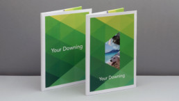
Downing have raised and invested over £1.6 billion into businesses that make a difference, including renewable energy and care homes. Downing's requirement was to breathe new life into their brand and identity. The aim was to produce a solution that would inspire employees and clients alike. The outcome was an identity that had the ability to be individually personalised and to bring their clients into their story.

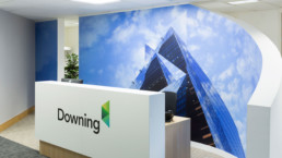
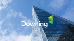
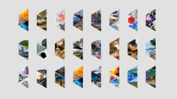
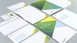
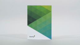
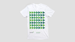
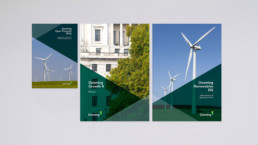
The symbol is a graphic interpretation of Downing’s investment community, portraying Downing as an integral centrepiece, perfectly connecting the outer sections that represent the investors and investee companies. The symbol is also a lens, demonstrating how Downing view an investment from every perspective. Further to this, the symbol can be personalised by every member of the team, flooded with imagery it depicts the differing personalities that make Downing who they are.

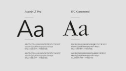
Although not formalised in any kind of style guide, Avenir was already being used within Downing’s marketing collateral, so it made sense to retain it. Especially as it worked perfectly with the design approach. Garamond became the secondary typeface, to add a level of contrast and maturity and to reflect Downing’s history and reputation.
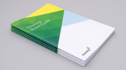
The Downing Brand Guide encapsulates everything that Downing is. From the core brand statements, to their full story and the identity style guide. The identity guide includes detailed accounts of everything from typographic styles to colour palettes; documenting how to consistently apply the Downing look.
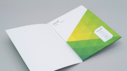
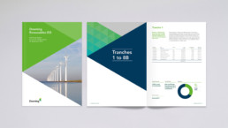
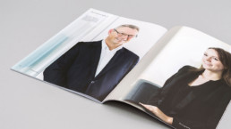
Due to the nature of their business, Downing produce a large amount of publications, both printed and digitally. Annual and half yearly reports, application forms, investment guides and brochures – a clear distinction was needed between each. Working closely with the marketing team, a series of templates were created that they could populate in house and that clearly defined each type of communication.
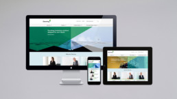
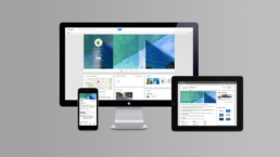
One of the largest parts of any identity is its online presence. Working with developers on the information architecture, user experience and user interface, Downing were involved every step of the way ensuring the final delivery communicated their proposition. The website can be seen at downing.co.uk.