Claydon Reeves
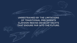
Claydon Reeves have over 30 years of experience in the superyacht industry. Their sole aim is the creation of unique and progressive designs through a tailored and flexible process. Unrestrained by the limitations of traditional precedents Claydon Reeves are looking ahead to develop superyachts that endure far into the future.

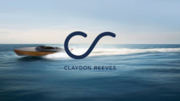
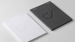
The logo had to reflect the outstanding quality and high end nature of their work, whilst developing a distinctive style that would set them apart from their competitors. The finished mark draws inspiration from the shape of a wave and elegantly uses one carefully crafted line to create the partnerships initials CR.
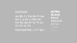
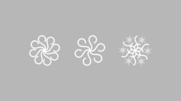
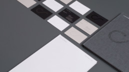
Influenced by technical drawings, the brand colours comprise of classic black, blue and grey tones with warm yellow and orange highlights. The typeface Gotham is modern with a strong design aesthetic and complements the minimal nature of the symbol. This symbol can also be crafted into specific motifs used for seasonal messaging.

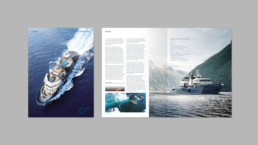
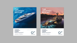
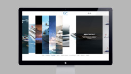
Advertising is important to Claydon Reeves as they exhibit at various shows around the world, including the Monaco Boat Show. Imagery plays a vital part in demonstrating their expertise and appealing to the market.